Note
This page was generated from a Jupyter notebook.
Download: bcdi_reconstruction_analysis.ipynb
BCDI Reconstruction Analysis#
This notebook provides a step-by-step workflow for analysing and comparing Bragg Coherent Diffraction Imaging (BCDI) reconstructions stored in CXI files. You’ll learn how to:
Explore CXI file structure with
CXIExplorerLoad specific datasets from reconstructions
Visualise and compare different conditions and quantities
Generate customised plots for analysis
Of course, this is just a starting point. You can adapt the code to suit your specific needs and datasets. Copy the code snippets into your own Jupyter notebook and modify them as needed.
1. Setup and Initialisation#
[ ]:
# Import required packages
import matplotlib.pyplot as plt
import numpy as np
from IPython.display import display
from matplotlib.colors import LogNorm

import cdiutils

# Set default plotting parameters
cdiutils.plot.update_plot_params()
1.1 Set Paths to Your Data#
First, specify the directory where your reconstruction results are stored.
[2]:
results_dir = "path/to/the/results/directory" # Replace with the actual path to your results directory
1.2 Explore CXI File Structure#
The CXIExplorer lets you interactively explore the structure of your CXI files before loading specific data. This helps you identify available datasets and their paths. Here, we only use the CXIExplorer.explore() method, but an you can find more about how to explore CXI file in the explore_cxi_file.ipynb notebook.
Select one of your CXI files to explore:
[3]:
# Path to one of your CXI files for exploration
cxi_path = results_dir + "Sample_Name/S000/S000_postprocessed_data.cxi"

cxi_path = "/scisoft/clatlan/dev/tutorials/examples_and_tutorials/analysis/results/B18S2P1_Ni/S706/S706_postprocessed_data.cxi"

# Initialise a new explorer instance
explorer = cdiutils.io.CXIExplorer(cxi_path)

# Launch the interactive browser
explorer.explore()
[4]:
# Make sure to close the explorer when done
explorer.close()
1.3 Define Samples and Conditions#
Create a table matching experimental conditions to sample names and scan numbers. This will help organise your data for comparison.
[ ]:
# Create a table of conditions and corresponding samples
# Format: (condition_name, sample_name, scan_number)
table = [
    # Example entries - replace with your actual data
    ("Condition_A", "Sample_Name_A", 3),
    ("Condition_B", "Sample_Name_B", 6),
    ("Condition_C", "Sample_Name_C", 6),
    ("Condition_D", "Sample_Name_D", 3),
    # Add more conditions as needed
]
1.4 Load Data from CXI Files#
Now we’ll load specific datasets from each sample’s CXI file. Based on the file exploration above, you can identify which quantities to load.
cdiutils provides a convenient function to load data from CXI files. You can use the cdiutils.io.load_cxi function to conveniently load data from CXI files. The cdiutils library provides a convenient function to load data from CXI files. It requires the path to the CXI file and a dataset name to load. If the dataset name is not the exact full “key path”, say "voxel_size" instead of "entry_1/result_1/voxel_size", the function will find it for you anyway. Note that you can
provide as much as keys as you want, and the function will return a dictionary with the keys as the dataset names and the values as the data loaded from the CXI file.
[6]:
# List of quantities to extract from CXI files
quantities = (
    "support",
    "het_strain",
    "het_strain_from_dspacing",
    "dspacing",
    "amplitude",
    "displacement",
    "phase",
    "lattice_parameter",
    # Add or remove quantities based on your needs
)

# initialise the voxel_sizes dictionary
voxel_sizes = {condition: None for condition, _, _ in table}
# Path to the results directory

# Initialize a dictionary to store the structural properties
structural_properties = {condition: {} for condition, _, _ in table}

# Path template for post-processed data
path_template = results_dir + "{}/S{}/S{}_postprocessed_data.cxi"

# Load data for each condition
for condition, sample_name, scan in table:
    path = path_template.format(sample_name, scan, scan)

    # Load all specified quantities from the CXI file
    structural_properties[condition] = cdiutils.io.load_cxi(path, *quantities)
    voxel_sizes[condition] = cdiutils.io.load_cxi(path, "voxel_size")

# Apply support mask: set values outside the support to NaN
for key in quantities:
    if (
        key != "support" and key != "amplitude"
    ):  # Keep amplitude outside support
        for condition, _, _ in table:
            structural_properties[condition][key] *= (
                cdiutils.utils.zero_to_nan(
                    structural_properties[condition]["support"]
                )
            )
2. Visualise and Compare Datasets#
2.1 Configure Plot Settings#
Set up color maps and value ranges for visualising different quantities. The cdiutils package provides default configurations that you can customize.
[7]:
# Get the default plot configurations from cdiutils
_, _, plot_configs = cdiutils.plot.set_plot_configs()
To check out the predefined colour maps, you can copy/paste this code in a cell and run it:
print("Plot configs:")
print("=============\n")
for quantity, d in plot_configs.items():
    print(f'"{quantity}": ')
    for key, value in d.items():
        print(f'\t"{key}": {value}')
2.2 Visualise Individual Quantities#
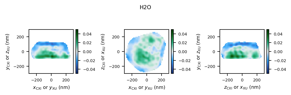
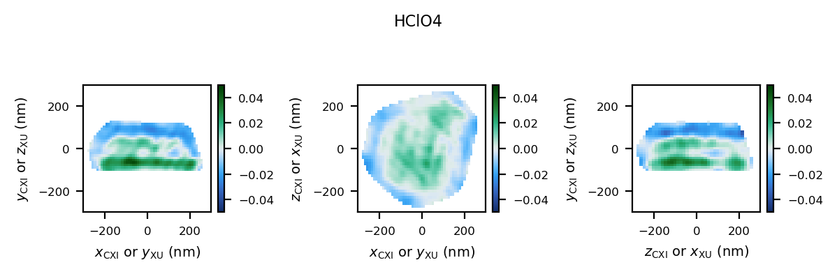
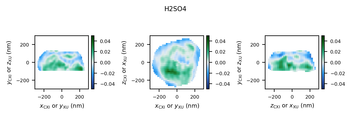
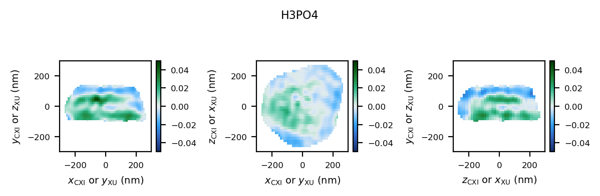
Let’s start by plotting a single quantity (e.g., heterogeneous strain) for all conditions to compare them.
With ``cdiutils.plot.plot_volume_slices``: This function allows you to plot slices of a single 3D data volume. You can specify the quantity, colormap, and value range for visualisation.
Notes:
If no ``convention`` is provided, we use “natural” plotting conventions, i.e.:
first slice plot: slice taken at the middle of dim0, dim1 along y-axis, dim2 along x-axis
second slice plot: slice taken at the middle of dim1, dim0 along y-axis, dim2 along x-axis
third slice plot: slice taken at the middle of dim2, dim0 along y-axis, dim1 along x-axis
[8]:
# Select the quantity to visualise
quantity = "het_strain"  # Change this to any quantity from your list

# Plot the selected quantity for each condition
for condition, _, _ in table:
    fig, axes = cdiutils.plot.plot_volume_slices(
        structural_properties[condition][quantity],
        title=condition,
        cmap=plot_configs[quantity]["cmap"],
        # comment this block if you don't need real size extents
        voxel_size=voxel_sizes[condition],
        data_centre=(0, 0, 0),
        show=False,
        convention="cxi",
        # Adjust these colouring limits based on your data
        vmin=-0.05,
        vmax=0.05,
    )

    # comment this block if you don't need real size extents
    for ax in axes.flat:
        ax.set_xlim(-300, 300)  # nm
        ax.set_ylim(-300, 300)  # nm

    # comment this block if you don't need real size extents
    cdiutils.plot.add_labels(axes)
    display(fig)
2.3 Comparing Multiple Volumes Simultaneously#
The plot_multiple_volume_slices function allows you to visualize and compare multiple 3D volumes in a single figure. It’s particularly useful for comparing the same quantity across different experimental conditions or different quantities for the same sample.
Basic Usage#
At its simplest, you can just pass multiple datasets:
cdiutils.plot.plot_multiple_volume_slices(
    *[structural_properties[c][quantity] for c, _, _ in table]
)
Customisation Options#
The function accepts all parameters from plot_volume_slices plus additional layout options:
Different Layouts: Choose between vertical (
"v") or horizontal ("h") stacking withdata_stackingReal-Space Plotting: Use
voxel_sizesanddata_centresfor physical unitsConsistent Views:: Apply the same convention to all datasets with
convention="cxi"or"xu"Custom Limits: Set uniform axis limits with
xlimandylimColorbar Control: Configure the
colorbarappearance withcbar_args
Advanced Example#
Here’s how to create a publication-ready comparison plot:
[ ]:
fig = cdiutils.plot.plot_multiple_volume_slices(
    *[structural_properties[c][quantity] for c, _, _ in table],
    voxel_sizes=[voxel_sizes[c] for c, _, _ in table],  # For physical units
    data_labels=[c for c, _, _ in table],  # Label each dataset
    data_centres=[(0, 0, 0) for _ in table],  # Center of each dataset
    convention="cxi",  # Use CXI convention for views
    # data_stacking="v",                                # Stack datasets vertically
    # pvs_args={"views": ["z+", "y+", "x+"]},           # Specific view directions
    cbar_args={
        "location": "right",  # Colorbar on the right
        "title": plot_configs[quantity]["title"],
    },  # Title from configs
    xlim=(-300, 300),  # Consistent x limits in the same units as voxel size
    ylim=(-300, 300),  # Consistent y limits in the same units as voxel size
    cmap=plot_configs[quantity]["cmap"],  # Apply a custom colormap
    vmin=-0.05,  # Set min value for colormap
    vmax=0.05,  # Set max value for colormap
    remove_ticks=True,  # Clean appearance without ticks
    title=f"{quantity} Comparison",  # Title above the figure
)
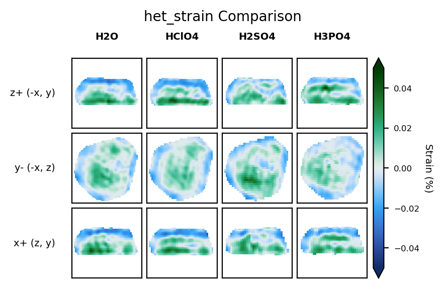
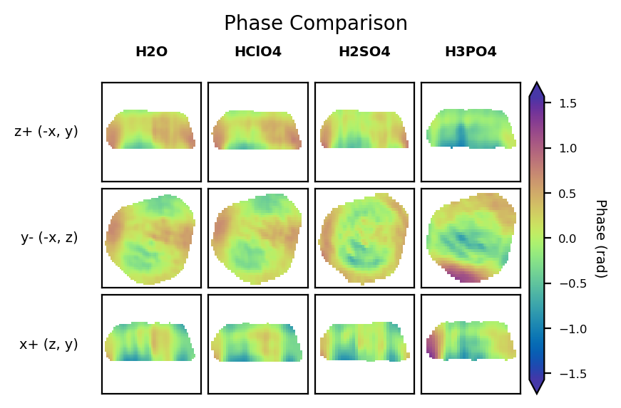
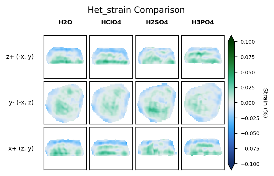
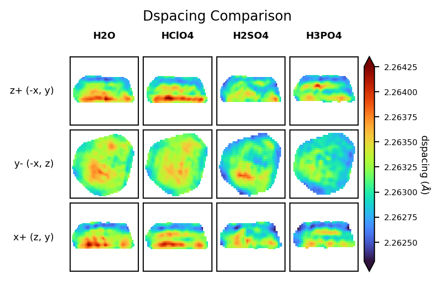
2.3 Compare Multiple Quantities Across Conditions#
To get a comprehensive view, we can plot all quantities for each condition. This helps identify correlations between different physical properties.
We need to set the minimum and maximum values for each quantity to ensure consistent visualisation across all conditions.
[ ]:
# Define min and max values for each quantity
# Adjust these values based on your data ranges
vmins = {
    "support": 0,
    "het_strain": -0.1,
    "het_strain_from_dspacing": -0.1,
    "dspacing": None,  # Set to None for automatic range
    "amplitude": None,
    "displacement": -0.2,
    "phase": -np.pi / 2,
}
vmaxs = {
    "support": 1,
    "het_strain": 0.1,
    "het_strain_from_dspacing": 0.1,
    "dspacing": None,
    "amplitude": None,
    "displacement": 0.2,
    "phase": np.pi / 2,
}
for key in plot_configs.keys():
    if key not in vmins:
        vmins[key] = plot_configs[key]["vmin"]
    if key not in vmaxs:
        vmaxs[key] = plot_configs[key]["vmax"]

# To visualise only a subset of quantities, uncomment and modify this list
custom_quantities = ["phase", "het_strain", "dspacing"]
# Then use custom_quantities instead of quantities in the loop below

# For each quantity, plot all conditions
for (
    quantity
) in custom_quantities:  # Change to custom_quantities if defined above
    fig = cdiutils.plot.plot_multiple_volume_slices(
        *[structural_properties[c][quantity] for c, _, _ in table],
        voxel_sizes=[voxel_sizes[c] for c, _, _ in table],
        data_labels=[c for c, _, _ in table],
        data_centres=[(0, 0, 0) for _ in table],
        convention="cxi",
        cbar_args={"title": plot_configs[quantity]["title"]},
        xlim=(-300, 300),
        ylim=(-300, 300),
        cmap=plot_configs[quantity]["cmap"],
        vmin=vmins[quantity],
        vmax=vmaxs[quantity],
        remove_ticks=True,
        title=f"{quantity.capitalize()} Comparison",
    )
3. Comparing Reciprocal Space Data#
Besides real-space reconstructions, it’s often valuable to compare the original diffraction data in the (orthogonalised) reciprocal space.
3.1 Load the Reciprocal Space Data#
This time, we will load the reciprocal space data from the .../S...preprocessed_data.cxi-type CXI files.
[12]:
# Initialise a dictionary for reciprocal space data
reciprocal_space_data = {condition: {} for condition, _, _ in table}

# Path template for preprocessed data
path_template = results_dir + "{}/S{}/S{}_preprocessed_data.cxi"

# Load reciprocal space data for each condition
for condition, sample_name, scan in table:
    path = path_template.format(sample_name, scan, scan)

    # Load orthogonalized detector data
    reciprocal_space_data[condition]["ortho_data"] = cdiutils.io.load_cxi(
        path, "orthogonalised_detector_data"
    )

    # Get q-space information
    reciprocal_space_data[condition]["q_spacing"] = []
    for ax in ("qx_xu", "qy_xu", "qz_xu"):
        reciprocal_space_data[condition]["q_spacing"].append(
            np.mean(
                np.diff(cdiutils.io.load_cxi(path, f"entry_1/result_2/{ax}"))
            )
        )

    # Get q-space center
    reciprocal_space_data[condition]["q_centre"] = cdiutils.io.load_cxi(
        path, "entry_1/result_2/q_lab_shift"
    )
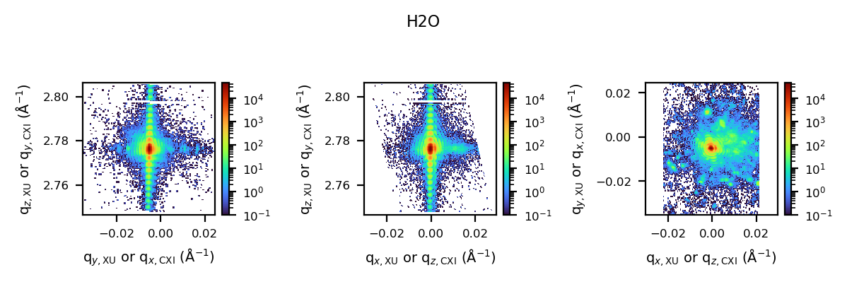
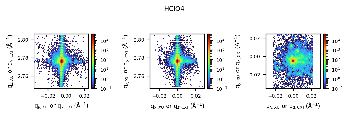
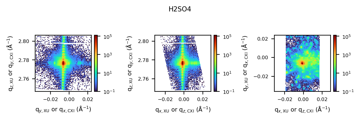
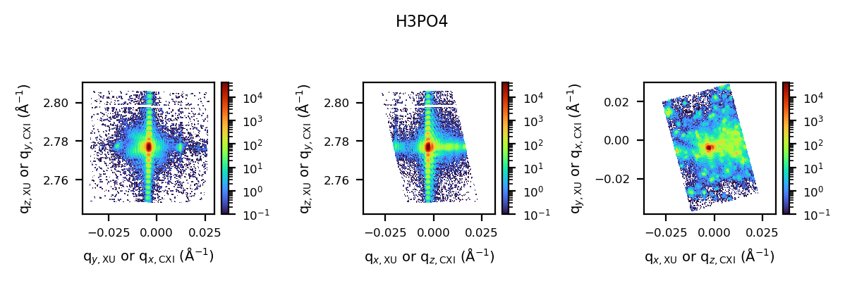
3.2 Visualise the Reciprocal Space Data#
We can use the same plotting functions as before to visualise the reciprocal space data. This allows us to compare the diffraction patterns across different conditions.
[130]:
# Plot reciprocal space data for each condition
for condition, _, _ in table:
    fig, axes = cdiutils.plot.plot_volume_slices(
        reciprocal_space_data[condition]["ortho_data"],
        voxel_size=reciprocal_space_data[condition]["q_spacing"],
        data_centre=reciprocal_space_data[condition]["q_centre"],
        title=condition,
        cmap="turbo",
        norm=LogNorm(1e-1),  # Log scale for diffraction patterns
        convention="xu",
        show=False,
    )
    # Add appropriate labels for reciprocal space
    cdiutils.plot.add_labels(axes, space="rcp", convention="xu")
    display(fig)
4. Advanced Analysis (customisable)#
Here you can add custom analysis specific to your research questions. Some ideas:
Calculate average strain or d-spacing values for different regions
Compare phase distributions across conditions
Extract line profiles through specific features
Perform statistical analysis on strain or displacement fields
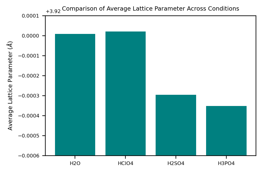
4.1 Example (calculate average lattice parameter in the particle):#
[13]:
# Example: Calculate average lattice parameter for each condition
avg_lat_par = {}
for condition, _, _ in table:
    lat_par_data = structural_properties[condition]["lattice_parameter"]
    support = structural_properties[condition]["support"]

    # Calculate average within support
    avg_lat_par[condition] = np.nanmean(lat_par_data[support > 0])
    print(
        "Average lattice parameter in "
        f"{condition}: {avg_lat_par[condition]:.5f} Angstrom"
    )

# Plot as a bar chart
plt.figure()
plt.bar(avg_lat_par.keys(), avg_lat_par.values(), color="teal")
plt.ylim(3.9194, 3.9201)
plt.ylabel(r"Average Lattice Parameter ($\AA$)")
plt.title("Comparison of Average Lattice Parameter Across Conditions")
Average lattice parameter in H2O: 3.92001 Angstrom
Average lattice parameter in HClO4: 3.92002 Angstrom
Average lattice parameter in H2SO4: 3.91970 Angstrom
Average lattice parameter in H3PO4: 3.91965 Angstrom
[13]:
Text(0.5, 1.0, 'Comparison of Average Lattice Parameter Across Conditions')
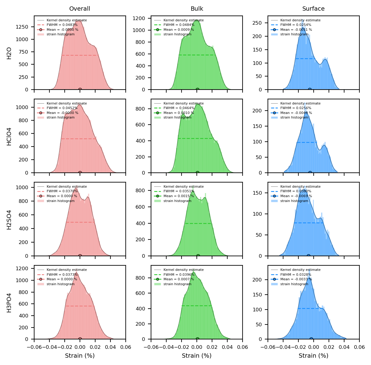
4.2 Example (customised histogram plots):#
Here we plot the het_strain_from_dspacing histogram for all conditions. You can modify the number of bins and the range of values to suit your needs. Note that if you plot other quantities, you may need to adjust the xlim and ylim values accordingly.
[14]:
quantity = "het_strain_from_dspacing"

colors = {
    "overall": "lightcoral",
    "bulk": "limegreen",
    "surface": "dodgerblue",
}


fig, axes = plt.subplots(
    len(table), 3, layout="tight", sharex=True, figsize=(6, 1.5 * len(table))
)

for i, (condition, _, _) in enumerate(table):
    histograms, kdes, means, stds = cdiutils.analysis.get_histogram(
        structural_properties[condition][quantity],
        structural_properties[condition]["support"],
        bins=50,
        density=False,  # If False you get counts, if True you get density
        region="all",
    )
    # Plot histograms and KDEs
    for j, region in enumerate(histograms.keys()):
        fwhm_value = cdiutils.analysis.plot_histogram(
            axes[i, j],
            *histograms[region],
            *kdes[region],
            color=colors[region],
            fwhm=True,  # Set to True for FWHM plot,
            # comment/uncomment lines below to play with the plot options
            bar_args={"edgecolor": "w", "label": "strain histogram"},
            kde_args={
                "fill": True,
                "fill_alpha": 0.45,
                "color": "k",
                "lw": 0.2,
            },
        )

        # Plot the mean
        axes[i, j].plot(
            means[region],
            0,
            color=colors[region],
            ms=4,
            markeredgecolor="k",
            marker="o",
            mew=0.5,
            label=f"Mean = {means[region]:.4f} %",
        )

        axes[i, j].legend(
            fontsize=4, markerscale=0.7, frameon=False, loc="upper left"
        )
        axes[i, j].set_xlim(-0.06, 0.06)  # change this according to your data
        axes[0, j].set_title(f"{region.capitalize()}")
        axes[len(table) - 1, j].set_xlabel("Strain (%)")
    axes[i, 0].set_ylabel(condition)

    print(
        f"Average {quantity} in {condition}: "
        f"{means['overall']:.5f} +/- {stds['overall']:.5f}"
    )

# Uncomment the line below to save the figure
# cdiutils.plot.save_fig(
#     "output.svg"  # 'svg' if you want to edit with inkscape, 'pdf', 'png'...
#     dpi=300,
# )
Average het_strain_from_dspacing in H2O: -0.00000 +/- 0.01561
Average het_strain_from_dspacing in HClO4: -0.00000 +/- 0.01606
Average het_strain_from_dspacing in H2SO4: 0.00000 +/- 0.01349
Average het_strain_from_dspacing in H3PO4: 0.00000 +/- 0.01397
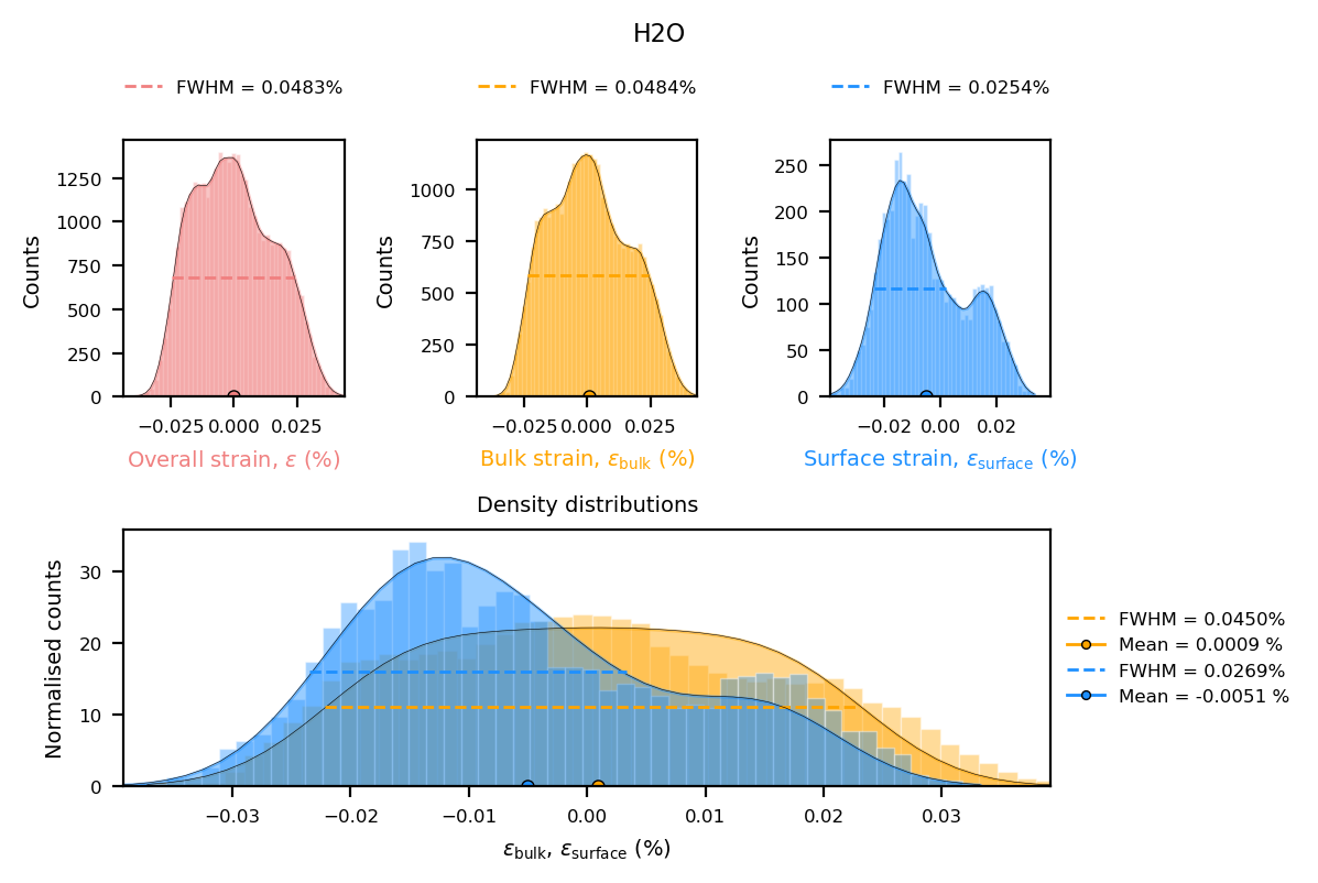
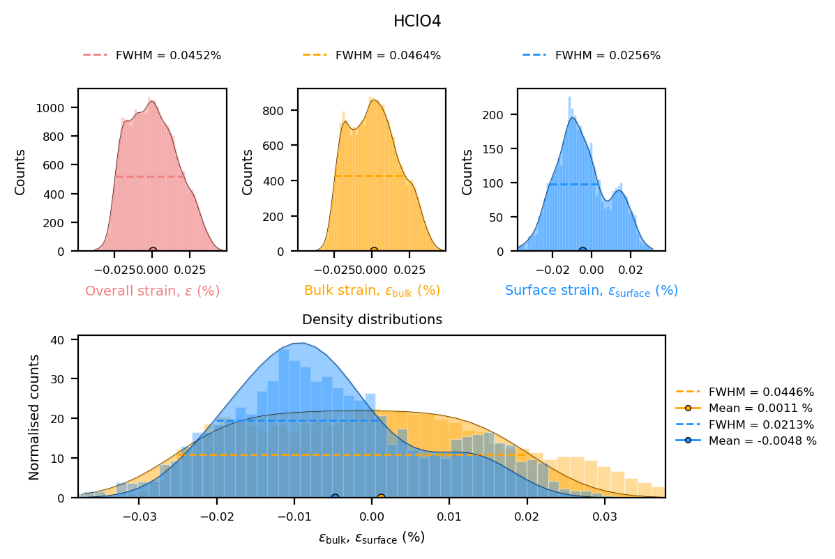
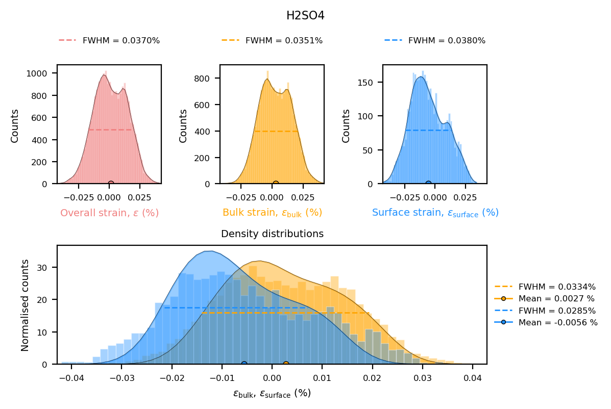
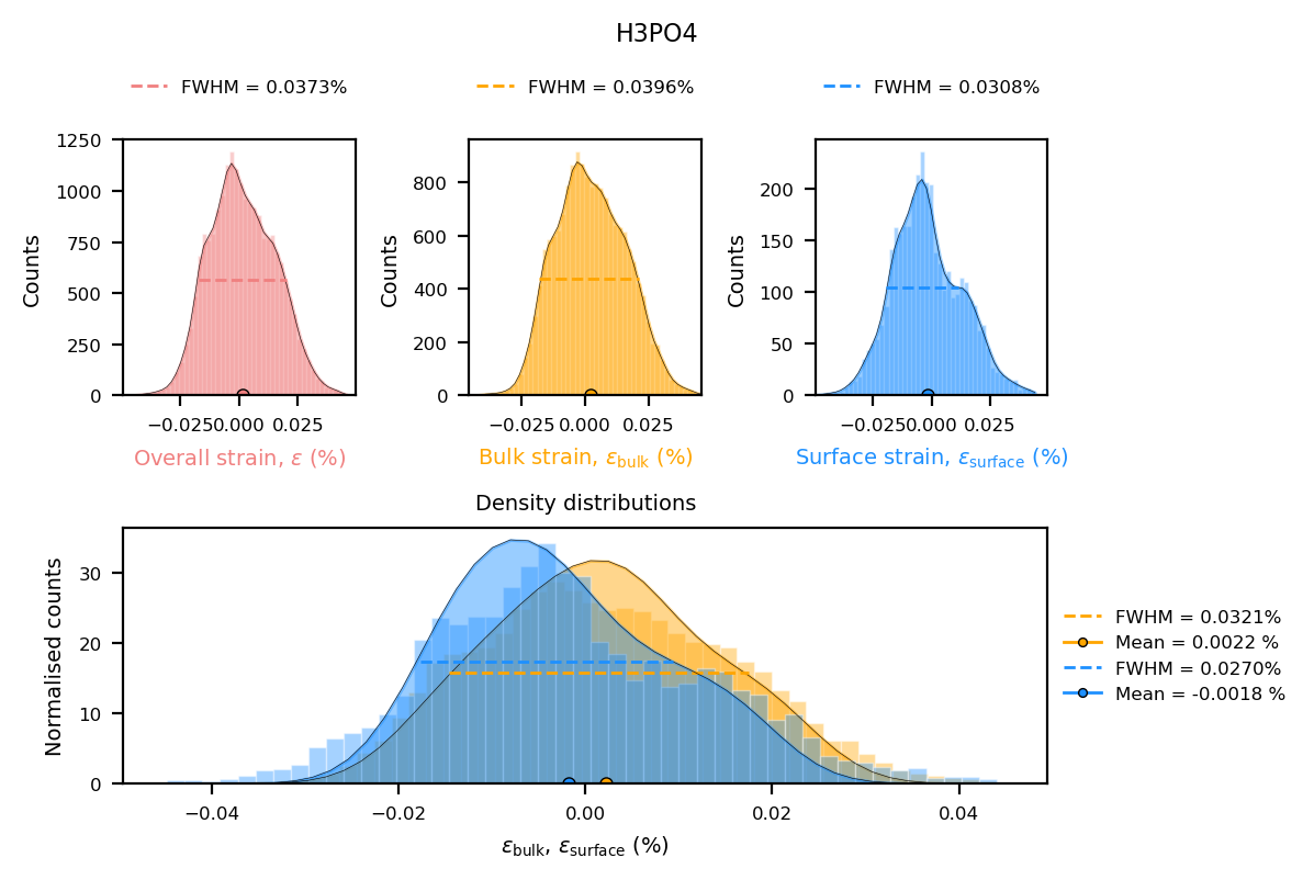
4.3 Example using plotter function used in the pipeline#
Strain histograms are plotted for the bulk and the surface of each reconstruction.
Note:
You can find all functions used for plotting in the ``BcdiPipeline`` workflow in the ``cdiutils.pipeline.PipelinePlotter`` class
[15]:
for condition, _, _ in table:
    strain_data = structural_properties[condition]["het_strain"]
    support = structural_properties[condition]["support"]
    cdiutils.pipeline.PipelinePlotter.strain_statistics(
        strain_data, support, title=condition
    )
5. Next Steps#
For further analysis, consider:
Exporting key results as publication-ready figures using
cdiutils.plot.save_fig()orplt.Figure.savefig()Performing facet analysis to identify crystallographic facets
Quantifying differences between experimental conditions
Correlating strain with structural features
Feedback and Support#
If you encounter any issues or have suggestions:
Email: clement.atlan@esrf.fr
GitHub: Report an issue
Credits#
This notebook was created by Clément Atlan, ESRF, 2025. It is part of the cdiutils package, which provides tools for BCDI data analysis and visualisation. If you have used this notebook or the cdiutils package in your research, please consider citing the package clatlan/cdiutils You’ll find the citation information in the cdiutils package documentation.
@software{Atlan_Cdiutils_A_python,
author = {Atlan, Clement},
doi = {10.5281/zenodo.7656853},
license = {MIT},
title = {{Cdiutils: A python package for Bragg Coherent Diffraction Imaging processing, analysis and visualisation workflows}},
url = {https://github.com/clatlan/cdiutils},
version = {0.2.0}
}